Here: A Movie Review – Tom Hanks , a Fixed Camera, and a Whole Lot of Weirdness!
Robert Zemeckis' "Here": An Ambitious Experiment That Falls Flat
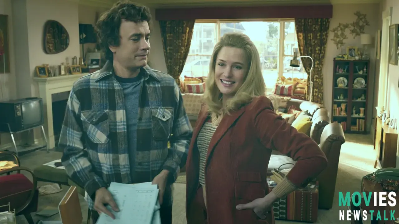
Robert Zemeckis ' Here is bonkers. Seriously ambitious. Starting with dinosaurs, then hopping through centuries – 1700s, 1940s, the whole shebang – finally ending in 2022 with a Roomba. It's like a time-lapse video of a single living room. But get this: the camera never moves. For the entire 105-minute runtime.
That’s the entire premise, basically. It’s insanely inventive. It features those legendary collaborators Tom Hanks and Robin Wright reuniting after Forrest Gump along with the very same writer. This isn’t some mega-action adventure with massive battle scenes; yet they somehow cram several lives, countless moments from decades, showing all those events within that one very spot. This makes use of several events including weddings, deaths, a few key Christmases, birthdays, and much more within the time frame; highlighting a lot of memorable and relatable everyday occurrences. The director shows many major events. And it works...kind of.
De-aging Technology, Unmoving Cameras, and Unconvincing Effects
Zemeckis, ever the tech innovator, is at the center of all these technological advancements in the industry! And this time the big innovation is using de-aging technology on Hanks and Wright, making Hanks look like his Splash days. And frankly, it does not work at all. It falls completely into that uncanny valley—that place where those special effects start feeling strangely real yet not at the same time, making everything unsettling and creating very unnerving visuals that hurt audience engagement. The whole thing looks shoddy, it lacks some creative input that would be necessary and ends up simply failing to convince viewers. You can also notice all the flaws! Cigarette smoke enters but not exits? Yeah, no, you totally notice those things in post.
There are a few attempts to showcase these scenes at that same moment! It focuses on these key events like showing someone's death due to COVID in glorious HD which frankly just isn't great – you might as well show anything. There are other attempts and some moments do come across quite well; however those more serious moments do often become bizarrely bad because it creates that huge disconnect! It fails to convey effectively those incredibly profound and complex scenes with great tact or skill, especially those involving race relations during various eras.
A Montage of Moments (That Don't Quite Connect)
There are a few things which work! The story does manage to showcase its ambition. The way that different timeframes get interconnected – that leaky roof becoming a pregnant woman's water breaking? That totally makes sense! Showing these kinds of small details is why these are enjoyable for many audiences.
It also gives a nod to some issues. Like the struggles from downsizing – Richard's dad’s very Willy Loman-like moment is sad: “They shrunk me.” That kind of touch makes this film effective in specific places.
Other stories feel slapped together; an Indigenous couple's tale added just so, some weirdly thrown-in bit with Benjamin Franklin. The overall presentation fails at building those kinds of emotional connections – especially involving those brief interactions with several characters not having even enough opportunity for the actors themselves to really bring much substance to these particular characters!
The Verdict: A Visual Gimmick Without a Compelling Story
Zemeckis uses some very nifty techniques that help visually portray various events in this shared timespace. Some picture-in-picture moments try to showcase the impact that time really has. Yet it mostly falls apart. There’s that disconnect in trying to be profound; that awkward over-sentimentality makes those attempts fail horribly. Even that supposed realistic visual; an emphasis on an entirely ordinary brick house that becomes strangely empty. It completely lacks its premise which leaves audiences very unconvinced. The very structure creates this emotionally airless environment. Those big themes ("Time flies!" “be true to yourself!”) are tacky.
The film has decent moments—especially when showing the real frustration from those couples that stay trapped in their circumstances– it highlights the pressures of various aspects that might greatly define many real families— yet the over-the-top emotions shown fails horribly to create much emotion from the viewers themselves; the whole thing becomes intensely impersonal; those smaller performances—even with well-known actors—feel completely limited, even trapped. Despite Hanks and Wright's efforts those emotional moments end up underwhelming and seriously hampered because it’s constrained within this structure and technology which simply does not work! It also includes many cheesy effects which adds some elements that make it all completely ineffective at moving its audiences and these points are simply far too noticeable.
The premise attempts to become grander but fails completely. If Zemeckis was going for “life’s monotonous,” he succeeded— a weirdly bleak observation that wasn’t quite what was advertised in the original pitch! It remains visually unique and technically impressive – it highlights those achievements however; it is also empty!
Box Office Projections and Other Key Elements for Here
The film opens on November 1st in the US and on January 17th, 2025 in the UK; it’s opening weekend box office prediction is rather low: Around $7 million and aims at appealing specifically towards the older age group (that audience previously enjoyed similar ventures; this may or may not completely work as it is expected); many reviewers on Rotten Tomatoes initially panned this movie; yet that remains just another element and its relatively high production budget ($50 million) suggests some significant loss.
Conclusion: Here is an experiment, but does it really work?
This movie really demonstrates that those clever technical aspects alone do not matter if there's no strong story. It tried using very, very modern technologies that some people didn't like– but there are flaws! That experimental nature of Here is interesting. Yet those gimmicks never justify a film's weakness. The movie might stay visually distinct– its creative techniques made many notice its existence; however, ultimately, Here feels technically impressive but sadly emotionally empty.

